
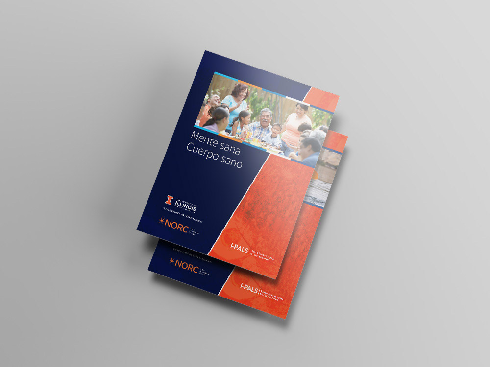
While designing in a language I can't speak presents its own unique challenges, designing for a culture that has different visual values was very eye-opening. Warm textures were used as an accompanying element while using the University of Illinois color palette to give the workbook covers a much more familiar and approachable feel.
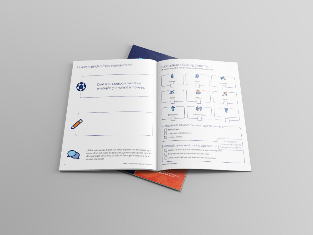
Clean, clear iconography from the Font Awesome library was used in the workbooks as well as larger type. This combination was intended to help those who may have limited or decreased eyesight from advanced age.
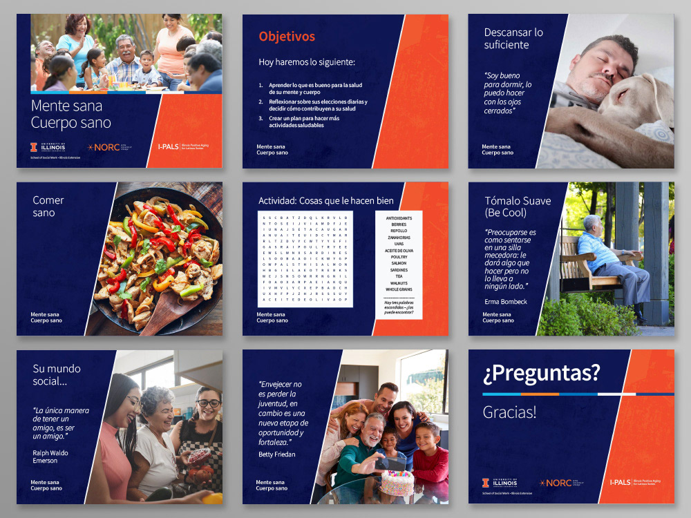
In addition to the workbooks, a presentation template was designed and accompanying slide decks were assembled in PowerPoint in both Spanish and English.